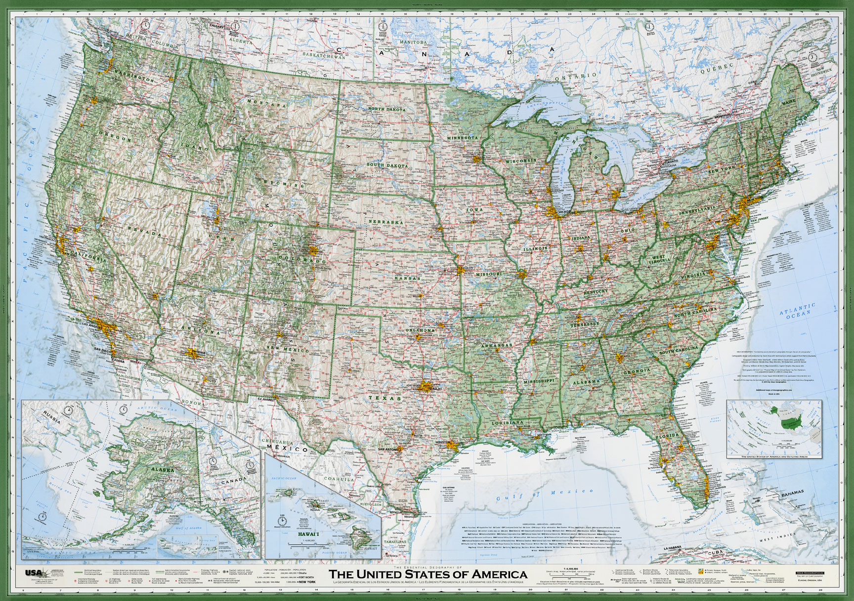
There are many maps of the US but there have been three that have really stuck out to me. Many map enthusiasts may have seen this first map as it was featured on slate.com. It’s David Imus’ “The Essential Geography of The United States of America.
What makes this map unique is the time and care that was put into this map. Imus spent 2 years creating this map working every day for a total of 6,000 hours. Here he talks about how he wanted the map to portray what you see out in the real world.
http://youtu.be/Ain5A4Y8TS0
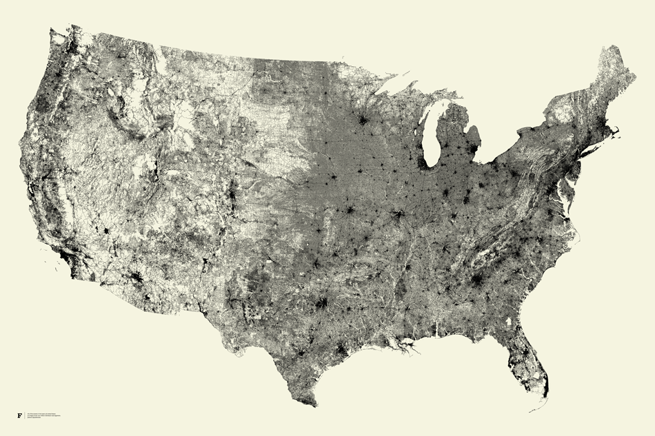
The next map on my list is a bit of an abstract cartographic representation of the United States. Fathom Information Design created a map composed solely the country’s roads called All Streets.
This map is reminiscent of veins and blood vessels in the human body which is rather fitting since that’s what our roads serve as in this country. The cities are easily represented by the concentration of roads and they give a great representation of the density of the US. Both these maps can be purchased for $30 at the links given below.
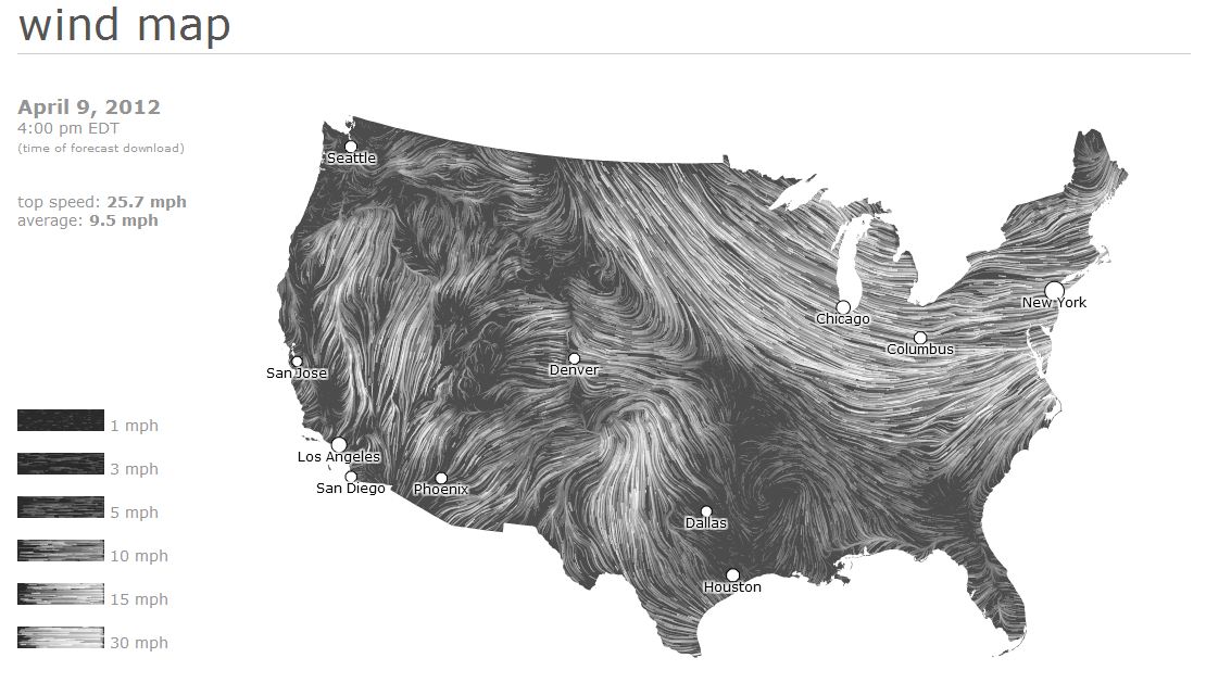
The third and final map in my favorite maps series is an animated map of wind patterns in the US. Wind Map was created by hint.fm which is a collaboration between Fernanda Viegas and Martin Wattenberg, a couple of artists/technologists working for Google’s “Big Picture” visualization group.
This map is like an expressionist painting in motion; absolutely hypnotizing. The data is pulled from the National Digital Forecast Database and is best viewed in Google Chrome. Be sure to follow the link below to see it in motion.
The Essential Geography of The United States Link: http://imusgeographics.com/
All Streets Link: http://fathom.info/allstreets/
Wind Map Link: http://hint.fm/wind/


Leave a Reply